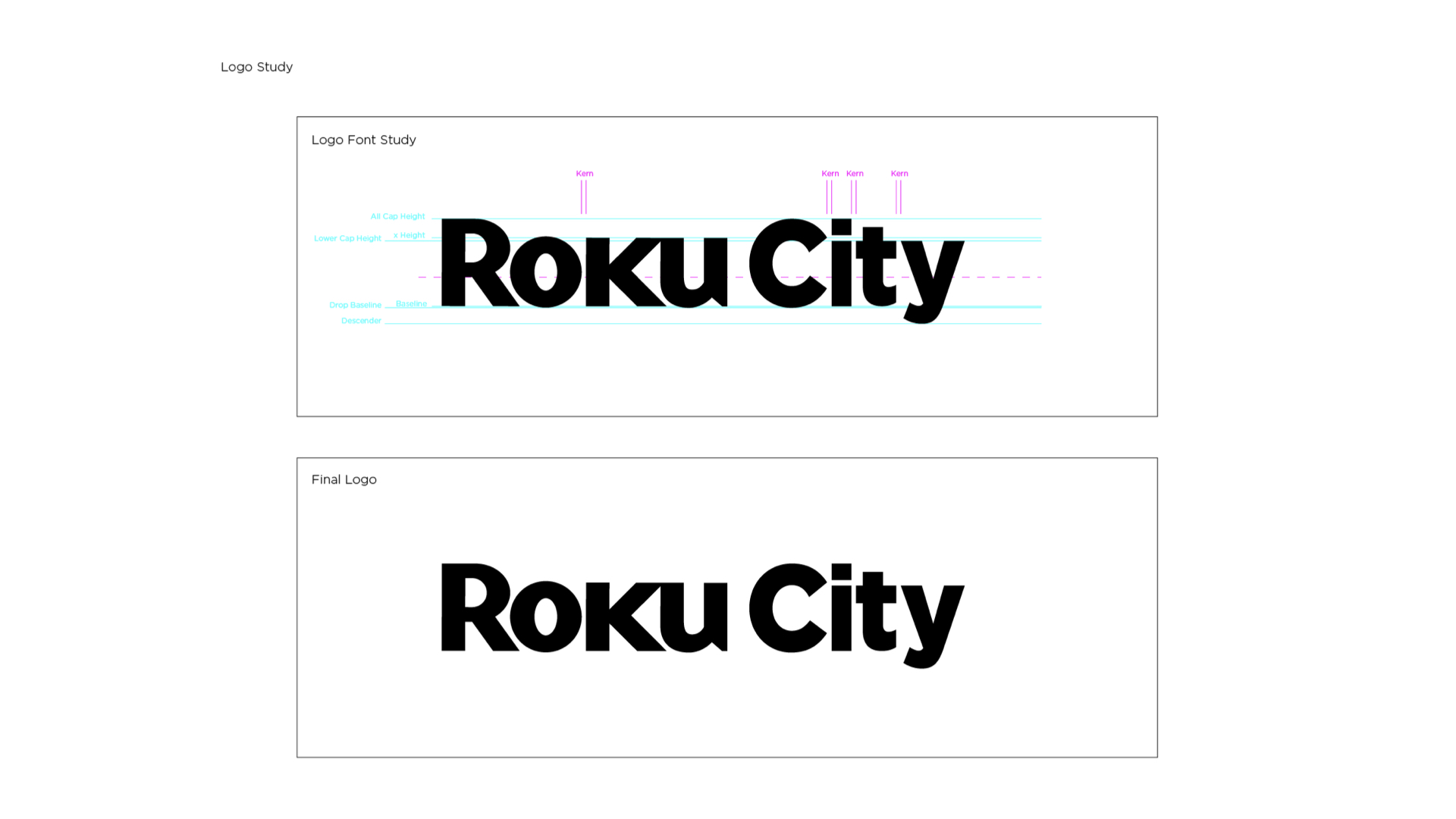
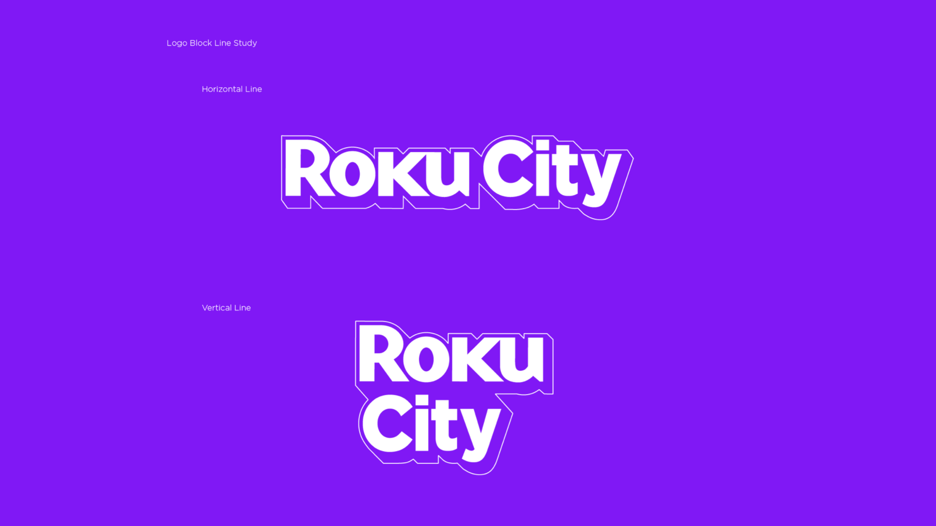
I was brought on for this project to design the Roku City logo, essentially integrating it into the already established Roku logo repertoire. Our design goal was to make it aesthetically seamless and relatable to the original logo, while still highlighting Roku City as a fun and unique visual experience on the Roku OS. The Roku logo is not a font but an originally created design, so my responsibilities was to illustrate the City part of the logo in Adobe Illustrator, produce print-ready files and create brand guidelines used for internal teams and external partners.
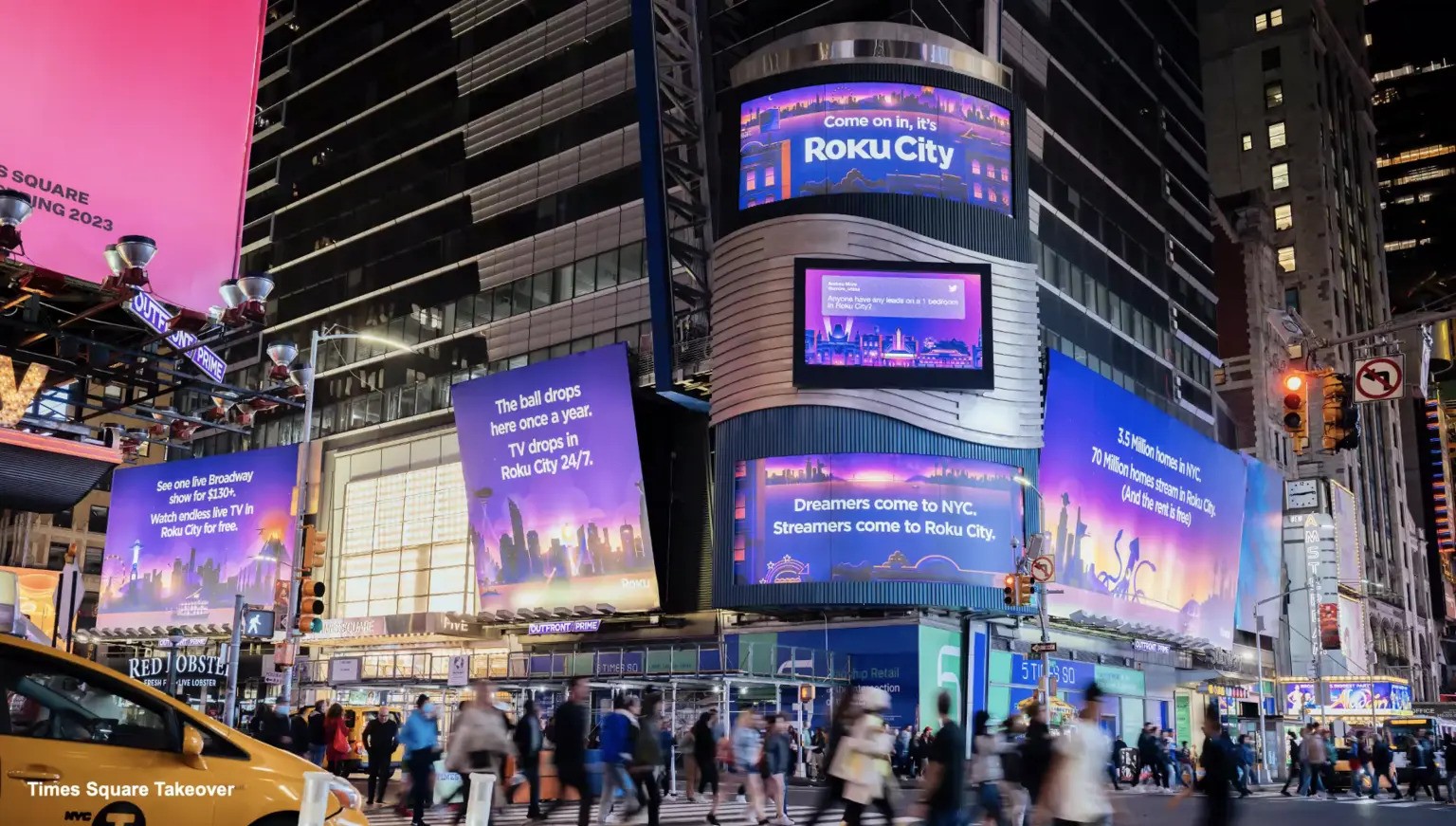
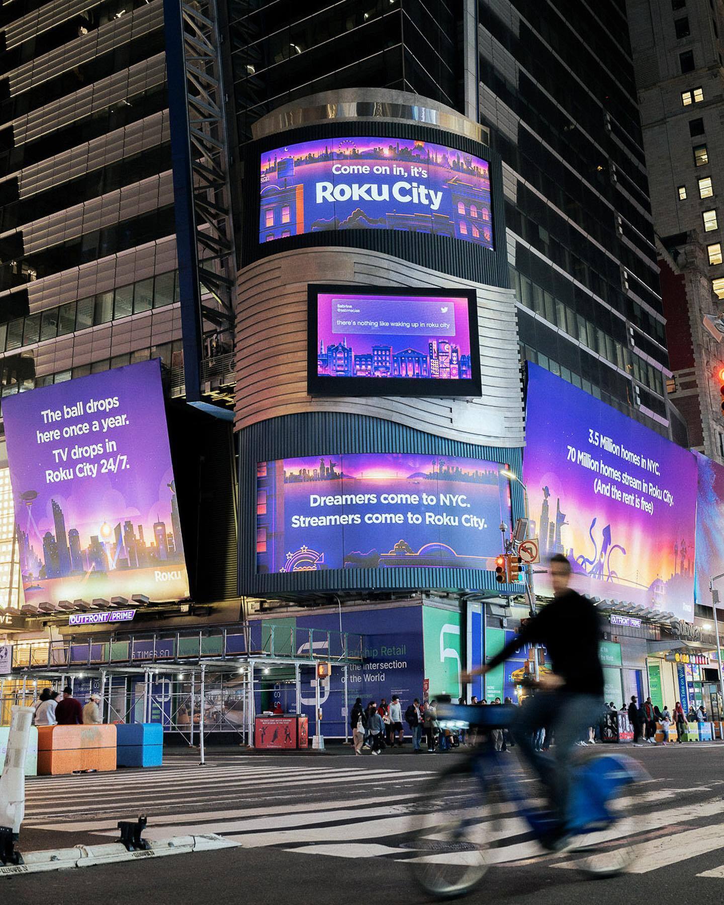
The Roku City logo was first introduced in multiple Times Square New York billboards and was a major success in introducing the Roku City sub-brand.
This was a fun project to be a part of to utilize my OOH and brand design expertise.


